

ABOUT BRAND
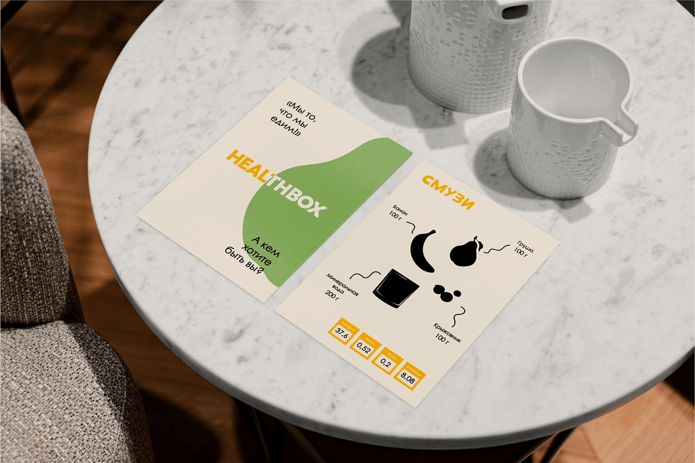
[ru] HealthBox — это полезный и информативный блог о здоровом питании, в котором нутрицолог делится с читателями и потенциальными клиентами своим опытом и знаниями, накопленными годами, чтобы каждый мог иметь доступную достоверную информацию, о пользе правильного питания.
[eng] HealthBox is a useful and informative healthy eating blog, where nutritionist share with readers and potential clients their experience and knowledge accumulated over the years, so that everyone can have accessible reliable information, about the benefits of good nutrition


TASK
[ru] Создать удобный и понятный брендинг, передающий комфортную и дружелюбную атмосферу блога. Дизайн должен цеплять взгляд и отражать миссию бренда — помочь каждому человеку улучшить качество питания с помощью доступных методов. Также пожеланием заказчика является использование ярких цветов в палитре.
[eng] Create user-friendly branding that conveys the comfortable and friendly atfosphere of the blog. The design should catch the eye and reflect the brand's mission - to help everyone improve the quality of nutrition through affordable methods. Also, the client's wish is to use bright colours in the palette.


ABOUT CONCEPT
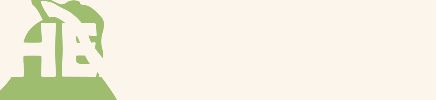
[ru] Логотип будет иметь три итоговых версии: основную, сокращённую и горизонтальную.
Отрисованному для концепции классическому гротескному шрифту был придан «небрежный» рукотворный вид. Концепция брендинга яркая, современная и с первого взгляда передаёт главную ценности бренда: отрытость, дружелюбность и помощь с помощью доступных методов.
Благодаря такой детализации и ярким фирменным цветам, сокращенная версия логотипа так же становится самостоятельной и узнаваемой эмблемой.
[eng] The logo will have three final versions: main, abbreviated and horizontal.
The classic grotesque font drawn for the concept was given a “casual” hand-made look. The branding concept is bright, modern and at first glance conveys the main values of the brand: openness, friendliness and help using accessible methods.
Thanks to such detail and bright corporate colors, the shortened version of the logo also becomes an independent and recognizable emblem.


Спасибо за интерес к моей работе! Я буду рада сотрудничеству с вами <3
// Thanks for the interest in my work! I'd be happy to work with you <3
Меня зовут Полина. Я бренд-дизайнер.
Вы можете связаться со мной и мы обсудим детали :)
// My name is Polina. I am a brand designer.
You can contact me and we can discuss the details :)


